Navigation Menu Redesign
COMPANY
Entrust
date
2022
ROLE
Director of Experience Design
EXPERTISE
UX and UI Design
IMPACT
Increased overall number of pages viewed per visit through the navigation menu.
Greater activity on pages that were previously difficult to find

The sidebar structure was a great solution for Entrust's broad portfolio of offerings.
Navigating Complex Terrain
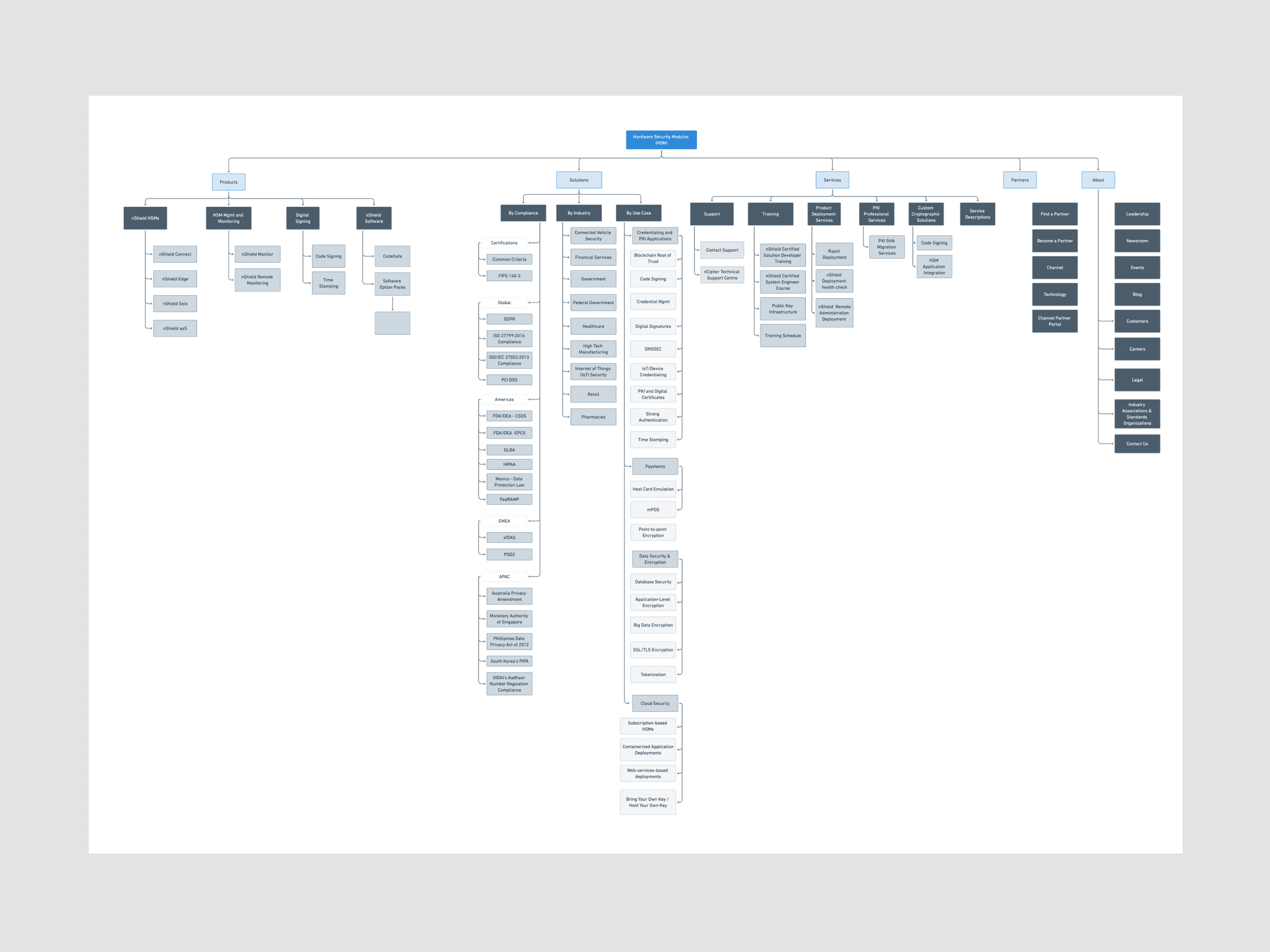
Our navigation at the time of this project was a multi-level menu system. We had chosen this approach during the rebranding effort of 2019. The theory of that UI was to allow the user to pick a path and eliminate irrelevant options the deeper they went until getting to their goal. As we added acquired company's offerings over time, the multi-level system couldn't bear the weight. Often users were going down a path, then backing up and trying again, or simply leaving the site. Additionally, some constraints in the code for the menus limited our options with layout. We realized that there was a lot of cross-over in our offerings and we needed a more information dense navigation experience.
An example of the tiered menu system we were moving away from. As products were added it quickly couldn't contain the content. In addition there were layout constraints based on poorly organized CSS & HTML from an early implementation of Sitecore CMS.
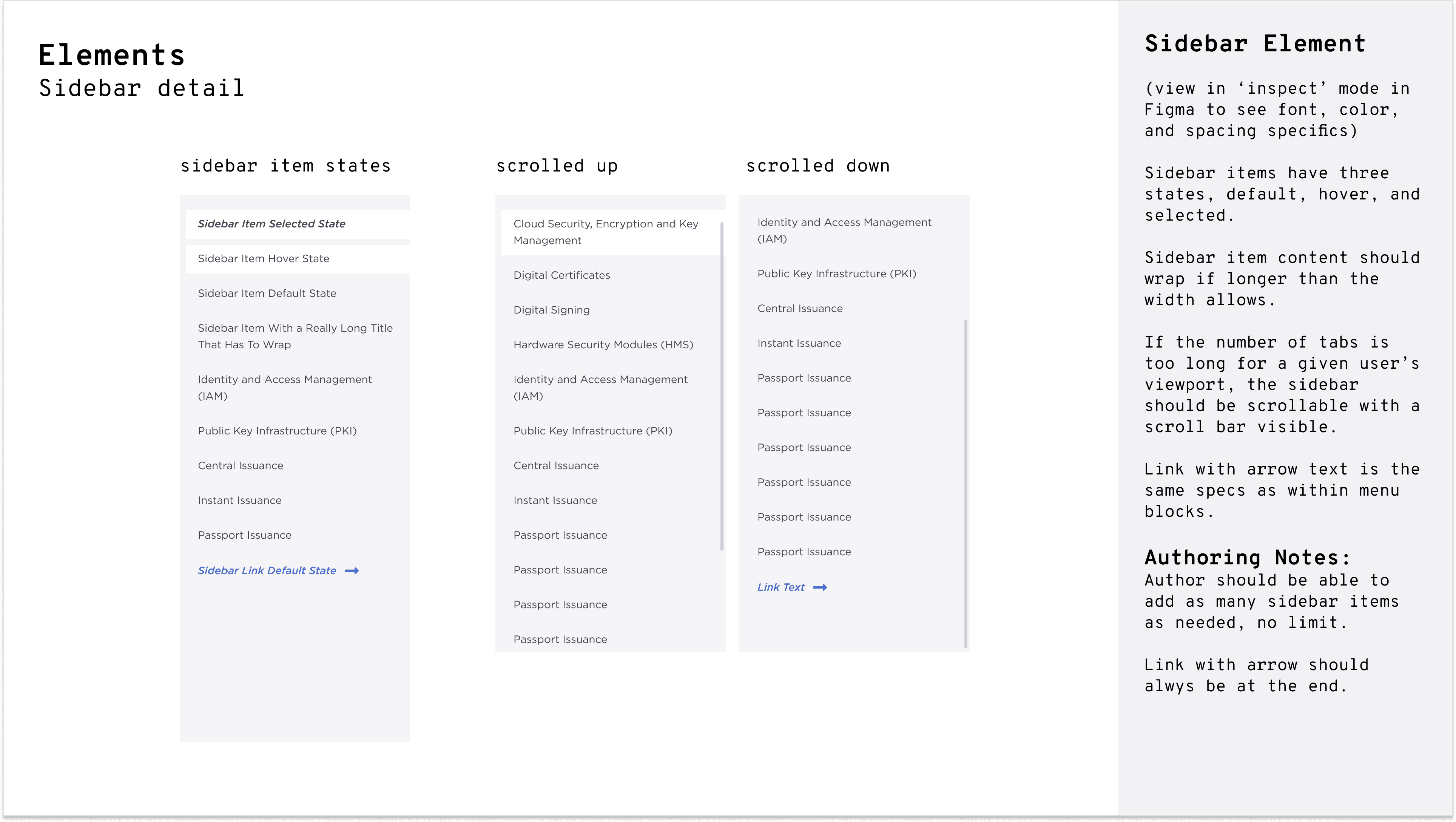
My Process for Evolving the Navigation Menus
Navigation is not a place to get overly unique in your designs. Unfamiliar patterns for familiar tasks don't typically serve the user very well. You wouldn't want street signs from town to town to vary wildly. "Let's make stop signs round and green!" Obviously bad.
My goals were to find a UI menu structure that allowed users to quickly orient themselves to our rather broad and sometimes confusing product and solution portfolio. It also needed to have a future-ready quality for any newly acquired company's offerings to fit easily into the system.
I was directing the UX team on other projects as well as doing the heads-down work myself on the navigation menus.
Discovery: Adjacent References
Given our uniquely broad offering in the cybersecurity space, finding relevant competitor examples was a challenge. I needed to look a little outside our industry to find companies with a large and broad offerings. The cloud services from Amazon and Google were obvious places to start.
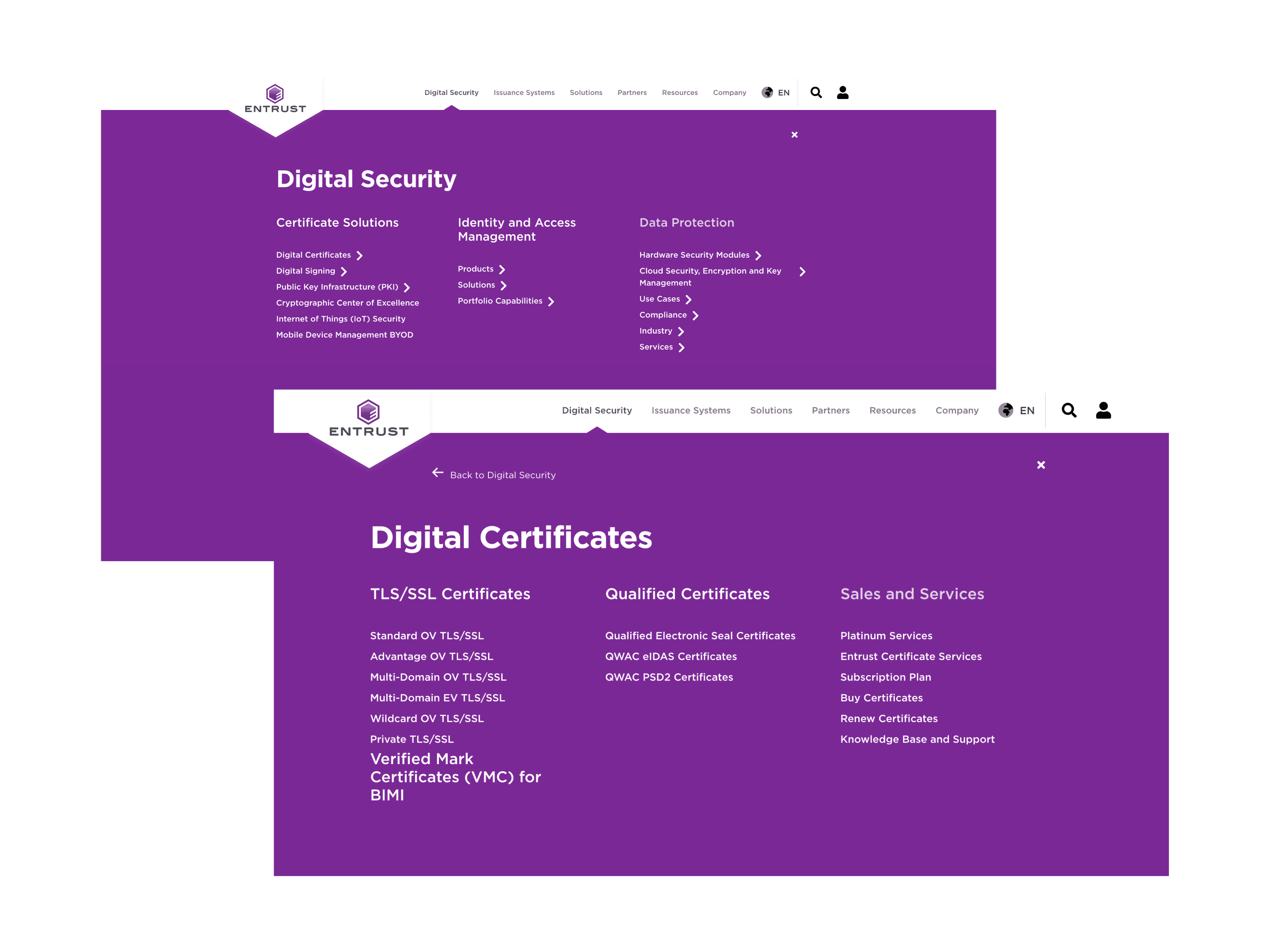
Both used a sidebar menu for categories under the main navigation items. This was appealing as it allowed a more detailed view of the landscape. Our overall number of items was less than both Amazon and Google, but I felt it was a nice fit. Especially considering our company was growing through frequent acquisitions. We needed a system that would handle the influx of new products and solutions frequently without having to change.
Mock it up
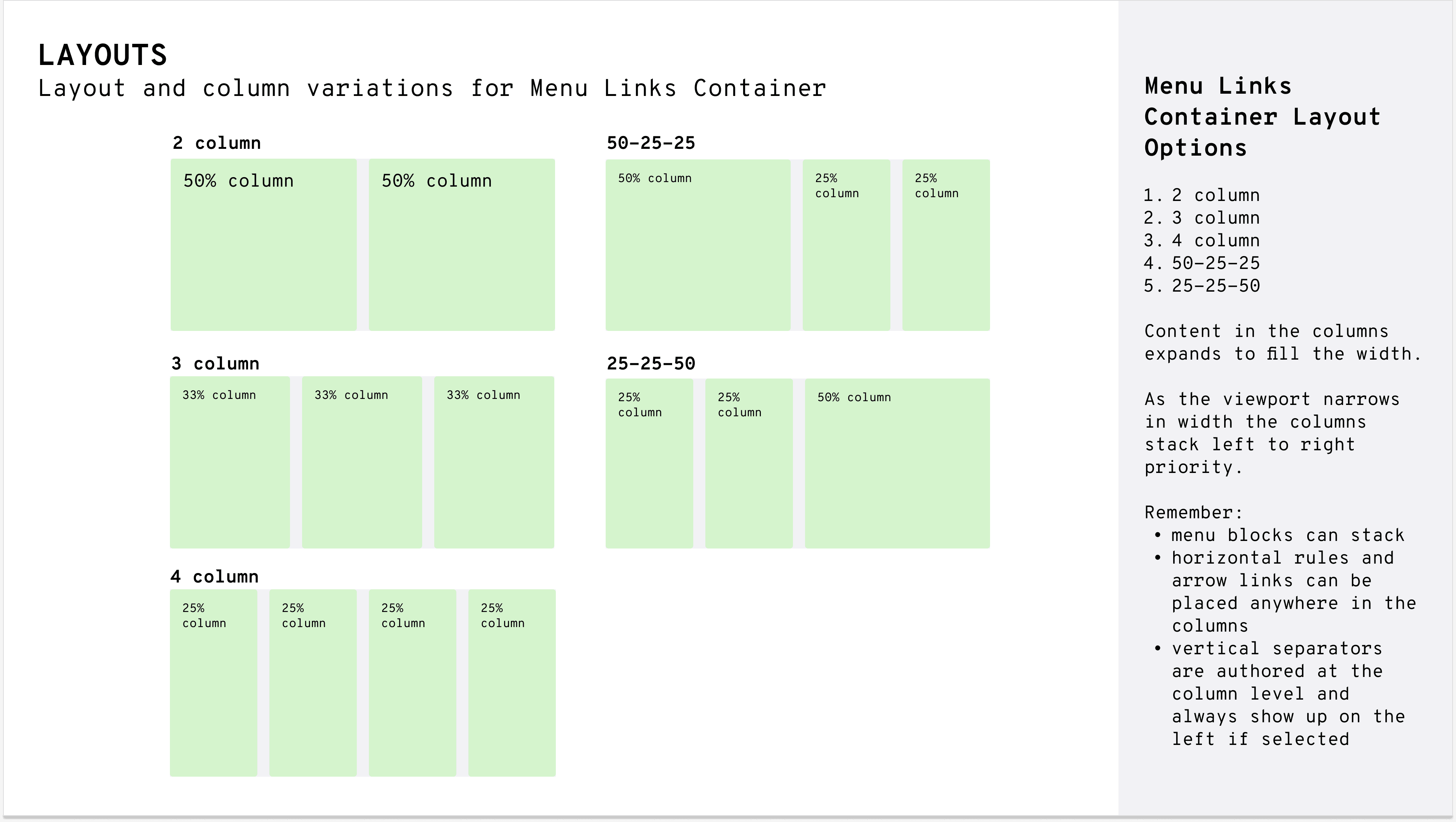
After deciding on a sidebar approach, I started to wire this up with Entrust's content. I found everything fell into place quite nicely. There were some decisions yet to be made regarding styling, linking, featured items, and how to handle descriptions for menu items.
Collaboration
At some point in the early stages of mockups I needed to get the product SME's involved along with our copywriting team. I needed to ensure the product category names were aligned with sales and support materials for one thing. We also had some room for brief descriptions for which we'd need content. This was also an early opportunity to get feedback on early mockups and prototypes.
Solution: A better way to orient
We had generally agreement on designs for the new menus. It would be a sidebar structure for both our 'Products' and 'Solutions' directories. It would be a single, flat structure for the other main navigation items.
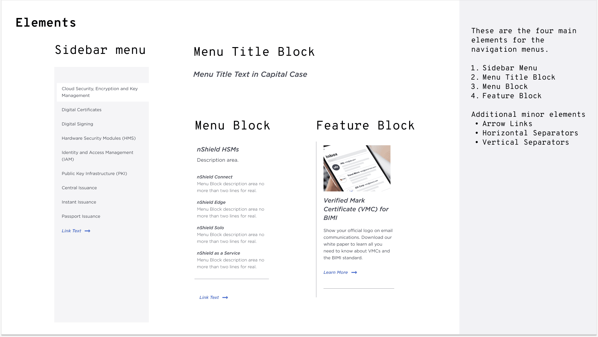
We'd allow for descriptions on menu items, and have an optional feature column to the right.


Results: Mostly good, some challenges remained.
As with any new design or creative solution, it's never all positives. Our new menu system did facilitate more clear pathways and orientation to our product portfolio as evidenced by improved visitor flow through our navigation menu links and decreased exit and bounce rates after clicking into our navigation system. All good there.
Our challenges were more internal and process/governance related. With more flexibility in the content structure, our businesses and marketers took some advantage of it by adding duplicate content with different naming, and not following rules for feature content.
In hindsight we didn't have the personnel, processes, or org structure to properly manage edits to the content of the menus. Overall it was a net win for user experience and we were able to shore up some of the content editing issues over time.